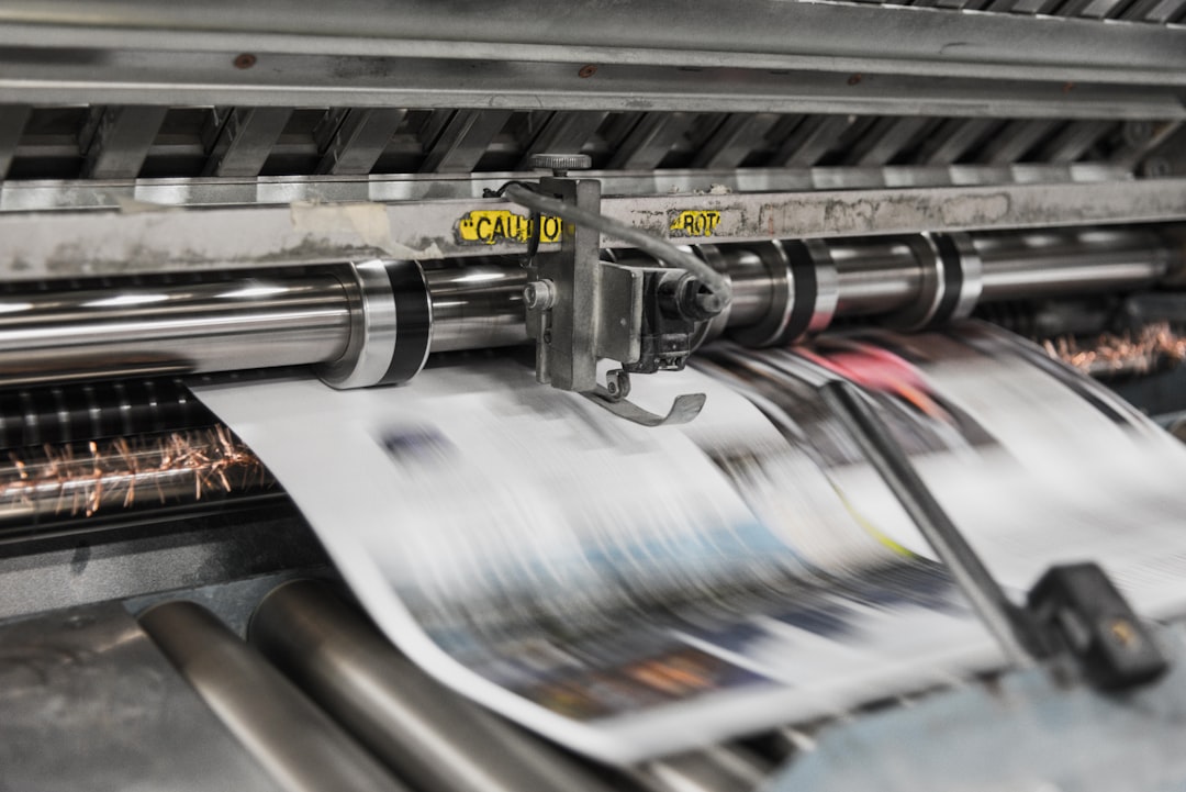
If you create, curate, or publish photos, the gap between a glowing screen and a physical print can feel mysterious until you learn the system behind it. The good news is that print accuracy is predictable when you control three variables: color management, display calibration, and cropping conventions. That matters whether your images live in cloud photo storage, flow through a photo backup service, or get sent to online photo printing labs for delivery. When those pieces are aligned, your final high quality photo prints will look intentional, not accidental.
This guide is built for creators, influencers, publishers, and anyone managing large image libraries across devices. You’ll learn how color profiles work, why monitor calibration is non-negotiable, how to export files correctly, and how to prepare images so prints land with the contrast and composition you expect. If your workflow already includes large-file sharing discipline, organized knowledge bases, or strong photo organization tools, you’re halfway there; the missing piece is making sure the digital master is print-ready.
1. Why Prints Don’t Match Screens by Default
Screens emit light; prints reflect it
The most common misunderstanding is that an image should look identical on a monitor and in print. In reality, a screen creates color by emitting light, while paper reflects ambient light. That means a bright blue sky may appear more saturated on an OLED or high-brightness monitor than on matte paper, even if the file is technically correct. Print shops compensate for this difference, but only if the file is built and exported with that environment in mind.
Every device has its own color behavior
Phones, laptops, tablets, and desktop monitors all interpret color a bit differently. Some are wide-gamut displays that can show more color than standard sRGB, while many lab printers are tuned around a narrower, predictable output range. If you edit on an uncalibrated display, the image you see is a moving target. This is why experienced creators treat color management for prints as part of the editing process, not a final afterthought.
Cloud workflows make consistency more important
Creators increasingly store masters in cloud photo storage so they can access the same library from a phone, laptop, and desktop. That convenience is excellent for collaboration, but it also means files may be viewed in different contexts before they’re printed. A client proof checked on a phone is not the same as a print-approved file viewed on a calibrated desktop. Your workflow needs a single authoritative version, plus export settings that lock in predictable output.
Pro tip: If your image looks “perfect” on an overly bright display, it usually prints too dark. Screen brightness is one of the most common causes of print disappointment.
2. Color Management for Prints: The Core Concepts You Need
sRGB, Adobe RGB, and why profiles matter
Color profiles are the translation layer between your file, your monitor, and the printer. sRGB is the safest default because it’s widely supported by browsers, apps, and many consumer print labs. Adobe RGB can preserve more saturated greens and cyans during editing, but it only helps if every step of your pipeline supports it. If you are unsure what your lab expects, sending an sRGB file is usually the least risky choice for online photo printing.
Embedded profiles prevent guesswork
Embedding a profile in your export tells the print workflow how the numbers in your file should be interpreted. Without it, the same image can look subtly different from app to app, browser to browser, and lab to lab. This is especially important when your images move through multiple systems, such as a catalog in distributed content workflows or a shared family archive in a photo backup service. Think of the profile as labeling the recipe so the printer knows what ingredients it is actually getting.
Soft proofing is your preview for paper
Soft proofing simulates how an image may render on a specific printer and paper combination. It cannot perfectly replace a print test, but it can reveal clipped shadows, muted reds, and oversaturated skin tones before you spend money. If your workflow supports it, proof against the exact lab profile or the closest available standard. This is the digital equivalent of previewing a layout before publishing, much like how teams validate outcomes in visual comparison pages that convert or review outputs in audit-ready document systems.
3. Monitor Calibration: The Foundation of Reliable Print Matching
Brightness is usually too high out of the box
Most displays ship far brighter than a print-friendly editing environment. A common target is roughly 80 to 120 nits for serious photo editing, though exact preference depends on room light and your paper choice. If your monitor is set to a gaming-like brightness, your edits will likely be too dark because you compensate for the intense screen glow. Lowering brightness is uncomfortable for many users at first, but it is one of the fastest ways to improve print accuracy.
White point and gamma shape the look of contrast
Calibration software typically helps set white point, brightness, and gamma. White point determines the warmth or coolness of your display’s neutral tones, while gamma influences midtone contrast. If gamma is too high, shadow detail disappears; if too low, the image can look flat and washed out. For creators who sell art prints or manage portfolios, consistency matters more than chasing a dramatic screen look.
Use hardware calibration when possible
Software-only adjustments are better than nothing, but hardware calibrators create more stable results and profile the display more accurately. A calibrated monitor gives you a trustworthy starting point, especially if you regularly export images for high quality photo prints or manage several output sizes from a single archive. If your library spans years of uploads, calibration also prevents old edits from drifting visually as you move between devices. That makes it much easier to rely on photo organization tools instead of re-editing files by memory.
Pro tip: Calibrate under the lighting where you actually edit. A bright window behind your monitor can make a properly calibrated file look too dark, even when the file is fine.
4. Cropping Conventions That Prevent Crooked Prints and Awkward Cuts
Every print size has a native aspect ratio
One of the most painful surprises in printing is losing the edges of a carefully framed shot. That happens because a 4x6, 5x7, 8x10, square, or panoramic print each uses a different aspect ratio. If your camera file does not match the chosen paper size, the lab will crop either the top/bottom or the left/right edges. Understanding this at the editing stage lets you compose with the final print in mind, rather than discovering a surprise cut after delivery.
Leave safe margins for faces and text
When a photo includes a person’s face, a logo, subtitles, or a key subject near the edge, add breathing room. Centering your subject slightly away from the frame border gives the lab room to crop without damaging the composition. This is particularly important for creators sending branded visuals, where a clipped logo can undermine credibility. It’s the same principle used in professional layout planning and even in content packaging systems that need to preserve important information, like crisis-ready content ops and brand asset systems.
Decide crop in-camera, not at the end
The best print workflows start with composition discipline. If you know you want a 4x5 vertical print, shoot and crop with that ratio in mind so you aren’t trying to rescue a wide landscape frame later. For social-first creators who repurpose content into prints, this is where a disciplined export workflow matters. It pairs well with a managed archive in cloud photo storage because you can keep one master and multiple print-ready variants without confusion.
5. File Export Settings That Preserve Quality
Choose the right file format
For printing, JPEG is still the most common export format, but quality settings matter. Save at high quality to preserve detail and avoid compression artifacts, especially in skies, gradients, and skin. TIFF is often preferred in high-end workflows because it preserves more information and supports larger files, but many consumer labs accept JPEG only. If your project requires the best balance of compatibility and quality, export a high-quality JPEG from a master file and keep the original in your photo backup service.
Keep resolution practical, not mythical
More pixels are useful only until they become unnecessary weight. For many print jobs, 300 PPI at final print size is a strong baseline, but the key is matching the lab’s recommendation and the image’s viewing distance. A large poster viewed from across a room can often print well at a lower effective PPI than a small desk print viewed closely. Treat resolution as part of the product decision, not a prestige contest.
Sharpen for output, not for screen
Web images often benefit from a different sharpening treatment than print files. What looks crisp on a backlit screen can appear harsh on paper, especially on glossy or semi-gloss stock. Export sharpening should be gentle, targeted, and aware of print size. This is where disciplined file naming and versioning matter, which is easier when your library is organized by purpose inside photo organization tools.
6. Paper, Finish, and Printer Technology Change the Result
Glossy, lustre, and matte behave differently
Paper isn’t just a surface; it is part of the color system. Glossy papers increase perceived saturation and contrast, while matte papers soften highlights and often reduce punch. Lustre or semi-gloss sits in the middle and is a favorite for portraits because it balances richness with reduced glare. If a photo looks too “soft” in print, the issue may be the paper choice rather than the file itself.
Inkjet and lab workflows are not identical
Different printers render color differently because of ink sets, paper coatings, and calibration standards. Consumer minilabs can be very consistent, but their output is designed for speed and scale, not custom fine-art matching. Art-print workflows can produce richer texture and better tonal separation, especially on archival paper. The right choice depends on whether you need fast turnaround, a family album, or museum-style presentation.
Match the medium to the message
A vibrant travel image may shine on glossy stock, while a moody black-and-white portrait often benefits from matte or baryta paper. If you’re printing a creator portfolio, choose a surface that supports the emotional tone of the work. The print’s tactile feel becomes part of the message, much like packaging decisions in other consumer categories where presentation shapes perceived quality, such as packaging-driven buying behavior and handmade craftsmanship.
7. A Practical Workflow for Predictable Results
Start with a master file in the cloud
Store your highest-quality original in cloud photo storage or a robust photo backup service, then create print variants from that master. This protects you from accidental overwrites and makes it easier to maintain separate exports for web, client proofing, and print. A well-named file structure can save hours when you need to re-order or reprint. It also reduces the chance that you send the wrong crop or an old edit to the printer.
Edit on a calibrated display, then soft proof
After import, edit on a calibrated monitor with controlled brightness. Then soft proof using your printer or lab profile if available. Check shadows, skin tones, and highly saturated colors, because those are the first areas to shift in print. If the lab does not provide a profile, test with a few small prints and compare them to the screen in neutral lighting before approving a larger run.
Export with intent and keep a paper log
For each print project, note the output size, file format, profile, and paper type. That gives you a repeatable log for future jobs. When a client asks for a second run, you can duplicate the same settings instead of starting from scratch. This discipline is similar to operational systems used in other technical workflows, from compliance automation to simulation-driven planning: predictable inputs lead to predictable outcomes.
8. Comparison Table: What Matters Most by Print Scenario
Use the table below to choose the right settings based on your goal. The best workflow is not always the highest-spec one; it is the one that matches your output, budget, and turnaround needs. If you are producing family keepsakes, a premium online lab may be enough. If you are shipping art editions, you may need tighter control over paper, proofing, and archival inks.
| Scenario | Best Color Space | Recommended Export | Paper/Finish | Main Risk |
|---|---|---|---|---|
| Casual 4x6 family prints | sRGB | High-quality JPEG | Lustre or glossy | Overly bright edits printing too dark |
| Client proof album | sRGB | JPEG with embedded profile | Matte or lustre | Wrong crop or inconsistent versions |
| Portfolio prints | Adobe RGB during edit, convert for lab | JPEG or TIFF if accepted | Matte or fine-art paper | Muted saturation if profile handling is sloppy |
| Large posters | sRGB or lab-specific profile | High-res JPEG | Poster stock or satin | Soft focus becoming visible at close range |
| Art prints for sale | Managed profile workflow | TIFF or maximum-quality JPEG | Archival fine-art paper | Poor black levels and inaccurate skin tones |
9. Organizing Files So Print Versions Are Easy to Find
Use naming conventions that describe output intent
A filename like project-subject_8x10_print_sRGB_v03.jpg is far more useful than IMG_4927_final_final2.jpg. The goal is to make the intended output obvious even months later. This is one of the simplest ways to make photo organization tools do real work for you. It also reduces the chance of printing an unedited web export that was never meant for paper.
Tag masters, proofs, and finals separately
Mark your folders so you can instantly distinguish originals, proofs, and print-approved files. In cloud systems, that separation is especially helpful when multiple people can access the same album. A client can approve a proof without touching the master, and a family member can view shared images without risking the final archive. Good organization is a security feature as much as a convenience feature.
Keep a test-print folder
Many creators build a small test-print folder with representative skin tones, dark shadows, bright whites, and saturated color. That mini-library becomes your calibration reference across labs and seasons. If something suddenly shifts, you can print the same reference and compare it to older results. This kind of repeatability is the print equivalent of maintaining stable production systems in cloud workflows and structured content teams.
10. Common Mistakes and How to Avoid Them
Editing on an uncalibrated laptop
Uncalibrated laptops are the biggest source of false confidence. Their displays often vary wildly in brightness and color temperature, especially under auto-brightness settings. If you edit while traveling, create a habit of re-checking the image on a trusted calibrated screen before sending it to print. Otherwise, you may not notice a problem until the package arrives.
Forgetting to convert or embed profiles
Some apps quietly strip color profiles or alter them when exporting. That can make the same file look inconsistent across devices and labs. Always check export settings carefully, especially if your online photo printing provider gives explicit profile guidance. If the lab requests sRGB, convert intentionally rather than hoping the system will figure it out.
Letting cropping happen automatically
Auto-crop is convenient, but it can clip heads, hands, and design details. Before submitting, preview the crop box at the final aspect ratio and scan all edges. If the image includes text or important framing, create a dedicated version that already matches the target size. That small extra step often saves the entire order.
11. Real-World Examples: What Predictable Print Workflows Look Like
Influencer product shots
An influencer preparing a branded lookbook might store raw files in cloud photo storage, edit on a calibrated desktop, and export a print version with the exact crop for an 8x10 handout. Because the brand wants consistent skin tones and product color, the creator soft proofs against the lab profile before approving the order. The result is a print that matches the campaign mood rather than a generic retail interpretation.
Family memory books
A family archiving travel photos may care less about absolute color fidelity and more about preserving faces, skies, and candid moments. In that case, reliable backup, clean organization, and simple online photo printing are the priority. Keeping master files in a safe photo backup service ensures those memories remain printable years later, even if a device fails or a phone is lost.
Publishers and creators with large libraries
Publishers often repurpose a single image across newsletters, cover art, and promotional posters. For them, the discipline of versioning is essential: one master, several exports, and a clearly documented print recipe. This approach mirrors the structure of resilient content operations and helps teams avoid sending the wrong crop to production. It also pairs naturally with privacy-conscious sharing, something many organizations now prioritize in every workflow from media distribution to privacy-first platform design.
12. A Simple Pre-Print Checklist You Can Reuse
Check color first
Confirm that your display is calibrated and your file is in the correct color space. If you are sending to a consumer lab, sRGB is usually the safest final export. For specialized printers, follow the lab’s documented profile instructions exactly. Don’t rely on memory when the outcome depends on measurable settings.
Check crop second
Preview the final print size and make sure no important edges will be cut off. Watch for faces near the border, text too close to the trim, and awkward subject placement. If needed, create a new crop version instead of forcing one file to fit every size. This is especially important when a single image must work in multiple ratios for comparison-driven previews and physical prints.
Check output settings last
Verify resolution, file format, sharpening, and embedded profile before upload. If the lab offers a test print, use it. A small proof is far cheaper than reprinting a full set. Over time, a repeatable checklist becomes part of your publishing discipline, not an extra burden.
FAQ: Print Matching for Color, Contrast, and Cropping
1) Why do my prints look darker than my screen?
Most likely your monitor is too bright, your room lighting is too dim, or both. Screens emit light, so an image can appear brighter on-screen than on paper even when the file is correct. Calibrate your monitor to a print-friendly brightness and review prints in neutral lighting.
2) Should I export in sRGB or Adobe RGB?
For most consumer and online labs, sRGB is the safest choice because it is widely supported. Adobe RGB can be useful during editing, but if the lab doesn’t explicitly support it, a final sRGB export reduces surprises. When in doubt, follow the printer’s recommendations.
3) What’s the best monitor calibration setting for photo printing?
There is no universal perfect setting, but lower brightness, a stable white point, and a standard gamma are key. Many photographers aim for a restrained editing environment rather than a vivid desktop look. The best setup is the one that matches your viewing light and print output consistently.
4) How do I stop crops from cutting off heads or logos?
Compose with safe margins and check the print ratio before exporting. If the source image does not fit the target paper size, create a custom crop version. Never assume the lab’s automatic crop will preserve critical content.
5) Do I need special software for color management?
Not always, but you do need software and a workflow that respect embedded profiles and soft proofing. Many editors can handle basic color management correctly if configured properly. The more valuable investment is often a calibrated monitor and disciplined export settings.
6) How should I store print-ready files in the cloud?
Keep masters, proofs, and final print exports in separate folders with clear names. Your cloud photo storage should make it easy to retrieve the exact file that was approved for print. That protects you from accidental re-exports and version confusion.
Conclusion: Build a Workflow, Not a Guess
Print matching is not luck, and it is not reserved for professionals with expensive studios. It is the result of a reliable workflow: calibrated viewing, proper profiles, thoughtful cropping, and clean export settings. Once those pieces are in place, your images become predictable across devices, labs, and paper types. That predictability is especially valuable when your archive lives in cloud photo storage and must travel through a photo printing service without losing visual intent.
If you want every print to feel like a true extension of what you edited on screen, focus less on hoping and more on system design. Keep your masters safe, calibrate your monitor regularly, export with intent, and document what worked. Those habits turn printing from a gamble into a repeatable creative advantage.
Related Reading
- Gear That Helps You Win More Local Bookings - Practical gear choices that improve image quality and workflow efficiency.
- Visual Comparison Pages That Convert: Best Practices from iPhone Fold vs iPhone 18 Pro Coverage - Learn how side-by-side visuals shape audience trust.
- Best Practices for Sharing Large Medical Imaging Files Across Remote Care Teams - A useful model for moving large files accurately and securely.
- Crisis-Ready Content Ops: How Publishers Should Prepare for Sudden News Surges - Operational habits that reduce errors under pressure.
- Architecting Privacy-First AI Features When Your Foundation Model Runs Off-Device - A strong read on privacy-minded product design and control.